Connecting communities with Santander Elevate Program
A revolutionary learning ecosystem for their global leaders to work and learn.
The challenge
Leading financial services company Santander was in the need of defining the shape and direction of a new personalised learning ecosystem to strengthen and guide its high directors in becoming a bank of the future. Santander’s visionary Elevate program is aimed at transforming the company culture through an innovative virtual education tool connecting its top executives worldwide and promoting life-long learning.
This implied not only a technical challenge but the need to conceptualise and design a visual system in-keeping with yet pushing forwards the brand ecosystem, whilst simultaneously coordinating multiple and diverse stakeholders, as well as fluctuating phase implementations.
The outcome
Together with the Santander community of leaders worldwide, its HR team, and Mindset, Studio Banana led a profound co-design process that helped define the program’s identity & interface to be globally implemented; elevating the power of this brand through an innovative, forward-thinking unlimited learning platform.
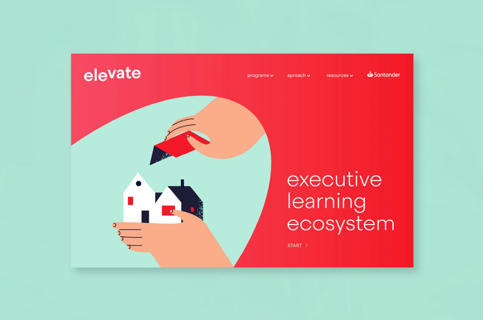
The strategic approach succeeded in putting the real users of this acceleration programme at the centre of all communications, listening to their needs and expectations in order to deliver a coherent, fresh and colourful brand identity combining shapes, photography, and illustrations reflecting a more human approach.

Taking the company vision to the next level
What does a successful future look like for Santander? To answer this question, we carried out a series of workshops with its community of top executives worldwide. The feedback received, alongside an in-depth understanding of its company culture and needs, would set the basis for making the visual approach the perfect response to their vision of embracing innovation and future trends through a more human, customer-centric approach.

The power of active listening
Our co-design approach was crucial for this community: it was the first time their input was taken into consideration to fuel the guidelines that would define the right visual strategy. As part of this process, we carried out several sessions of art and visual direction, introducing references until achieving a coherent and powerful look & feel.

The visual guidelines
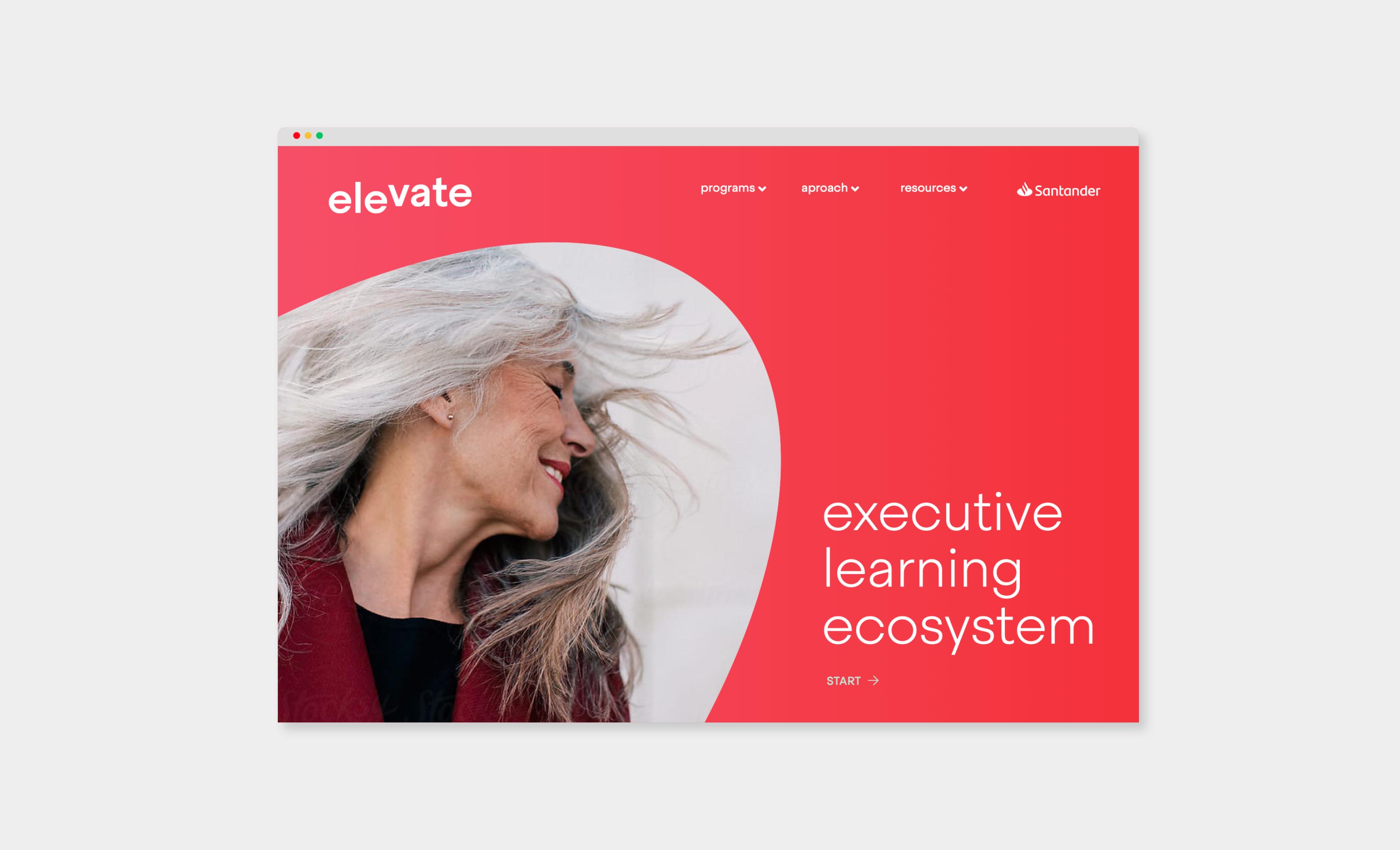
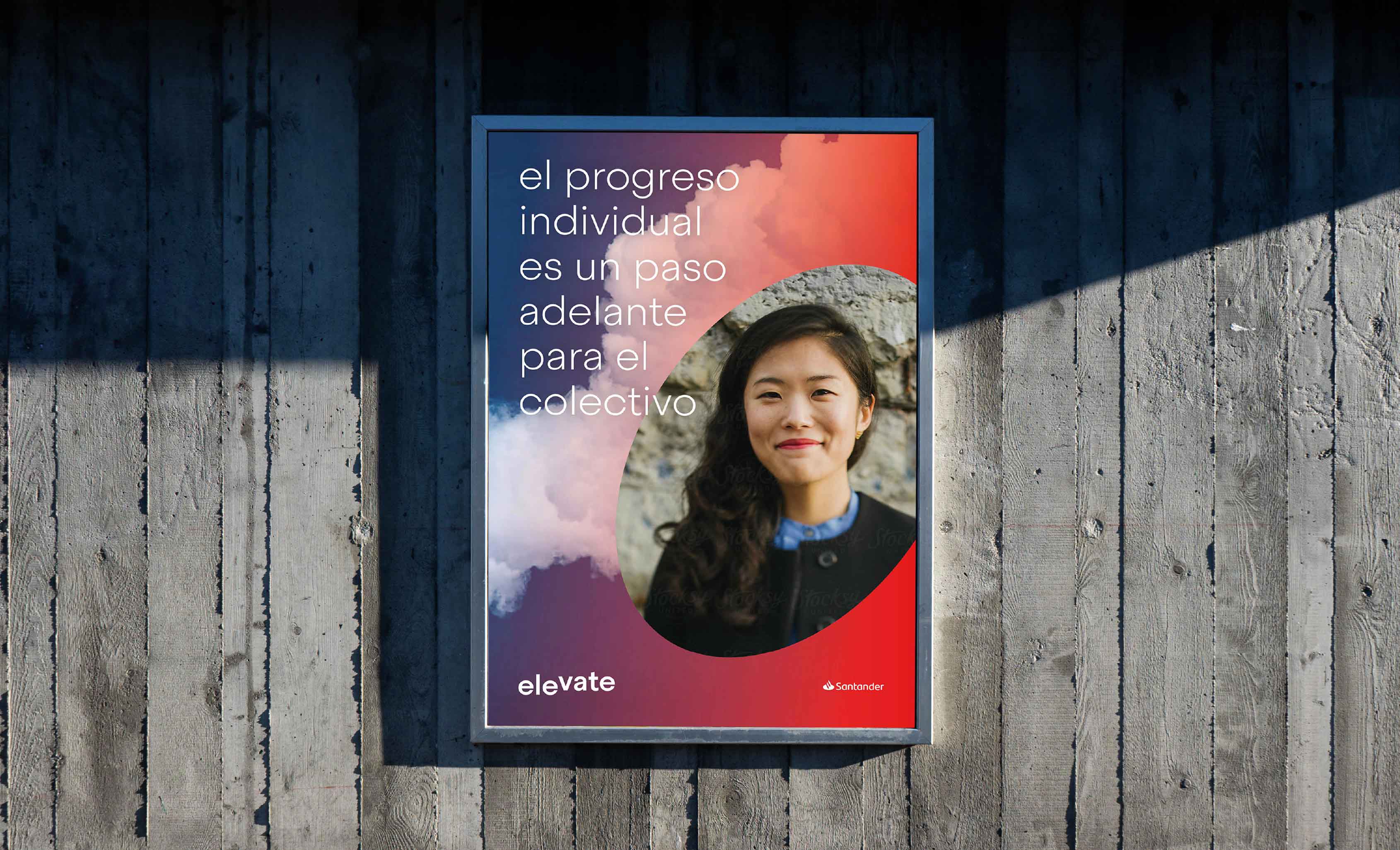
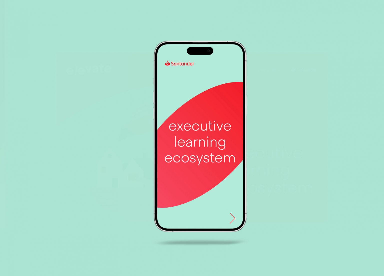
A bold, comprehensive visual identity across all materials is a key resource to provide the user with a seamless learning experience. Going back to the origins of the brand, we used Santander’s two key colours –red and an homage to their original green– to build a fresher approach, successfully managing to be coherent with the current ecosystem yet all the while standing out and driving forwards towards the future vision.
A strategic evolution
Metaphoric images chosen to draw the user’s attention, illustrations and drawings in plain, elegant colours, a Sans Serif logo purposely designed to “elevate” the name and plenty of other ideas not only helped enrich the learner journey, but also lay the groundwork to take the bank’s vision to the next level.

Conclusion
A user-centric methodology tailored to the needs of Santander’s executive community and aligned with its leadership’s strategic agenda was key to successfully redefining their workplace culture. This human-centered ecosystem transformed how top executives learn, collaborate, and connect, integrating brand experience design with agile learning formats.
The result is a flexible, globally accessible, and innovation-driven ecosystem which is different from traditional corporate learning models and helps foster community building, accelerates knowledge exchange, and strengthens organizational cohesion.